As a design-led organization that is focused on user problems and not just technical challenges, creating innovative solutions that are “simple” can be very challenging but fun. Many of our users come from technical engineering backgrounds, and this brings a level of complexity to the application.
The problem of digitizing P&ID and other types of industrial diagrams is traditionally a labor intensive, manual process of transcription done in CAD software, with risk of human error. We have spent time and effort to map this process into intuitive workflows that simplify while accelerating the user experience. Our decisions in the UI/UX weren’t by chance, but underwent rigorous user testing, conceptual development and continuous design ideations. But just because something can be simple doesn’t mean it has to be.
The Design Process
At DataSeer, we rely on traditional user experience methods to achieve a simple-to-use interface. Some of these are described below:
- User interviews
Understanding our users is the very first step in the design process. Before we can begin designing or development, it’s important to first understand the major pain points of the user’s journey and decompose each into smaller problems. User interviews are generally done in person, but over the past year we’ve had to rely on Zoom, Meet & Teams to communicate.
- Flow charts
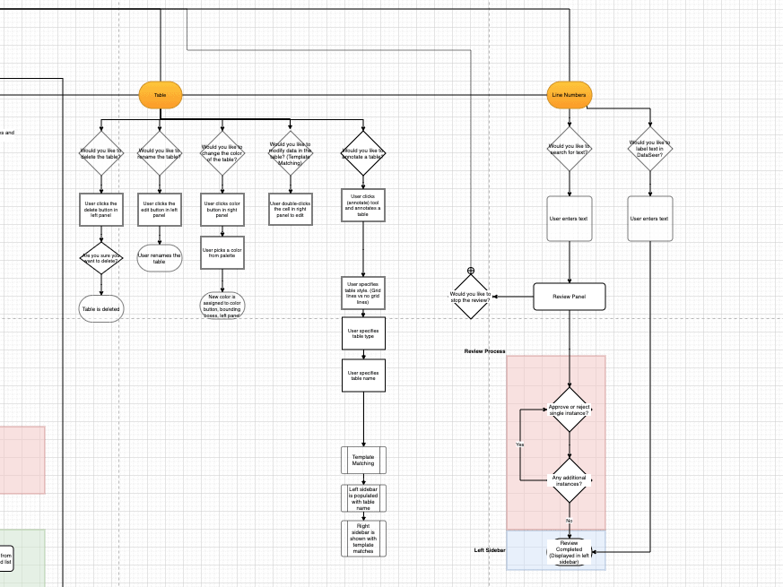
Everything has a structure, even our product and product features. Making sure these are documented and make logical sense are keys to ensuring product simplicity. We like Lucidchart for flowcharting (see below for a sample flow chart), but for focused features, utilizing plugins in Figma can also achieve a similar result.
- User testing
Spending time with our users is how we find out where their challenges and problems come from. An experienced DataSeer user can provide us with detailed insight into where the product doesn’t match a need or where s/he faces problems. User testing is not only crucial in the design process but also a prerequisite before a software release.
- Design ideations
Once we’ve gone through the above points, we then start with design ideations. We always experiment with out-of-box or crazy ideas to give us a larger breath of options. When we’re done ideating, we test these concepts with power users to observe and understand any of their pain points. It goes without saying, this is an iterative step.
Simplifying to Abstraction
Making things simple is not the only goal of DataSeer. Preserving necessary complexity is also important.
One aspect that is often misunderstood from non-designers is the reason some parts of the process are left “complicated.” In engineering, complexity is the norm and expected, due to theoretical principles in physics, science & math. In human-computer interaction (HCI), Tesler’s law says that “every application has an inherent amount of complexity that cannot be removed or hidden.”
Knowing this, we sometimes cannot simplify DataSeer UI/UX to the point of abstraction since this negatively impacts users’ goals and can even confuse. AI & machine learning may not always be the most suitable mechanism to get the user what s/he wants. It is always a balancing act between Design, Data Science & Engineering, and this healthy push-pull tension is the most challenging and fun aspect of developing a product like DataSeer.
Summary
Simple design is tough, but the payoff is tremendous especially for users. Methods in the design process such as user interviews, flowcharts, user testing & ideation sessions are traditional tools which have proven to work well. DataSeer — an application built by engineers for engineers — walks the tightrope of providing a valuable resource to help solve a problem that requires deep technical knowledge while ensuring an intuitive & easy-to-use UX that provides pleasure.
If you’ve any questions about our process or would like to just discuss psychology and design theory, please feel free to contact me.
Recommended Reading (AMZN)